Following our tribute to Vaughan Oliver, we bring to you three previously unpublished pieces. We still felt it was essential for us to share them, despite receiving them after our original piece. First, Simon Larbalestier, photographer and long-time colleague of Vaughan’s (his credits include the Pixies album covers) shares an emotionally powerful account of his relationship with Vaughan Oliver, illustrated with photos from his personal archives. Terry Dowling, Vaughan’s teacher, tutor and friend speaks with emotion of his brilliantly rebellious student who came to him for advice and his approval until the end of his life. Finally Ian Masters of the Pale Saints recalls working with Vaughan for the cover of In Ribbons (1992).
Simon Larbalestier, photographer
I first met Vaughan in the winter of 1985 when I was in London, having graduated from the Graphic Design program from Newcastle-upon-Tyne Polytechnic. But I was aware of his work for 4AD in the summer before, when one of my fellow students (Ian Ross) did a summer internship with Vaughan and his design company (23 Envelope with the remarkable photographer Nigel Grierson). Ian had pinned a series of posters on the walls of his studio space at college – I think the bands were This Mortal Coil, His Name is Alive and Wolfgang Press. I was immediately struck by the textures and ethereal imagery and on later investigation, I discovered that Vaughan had also been a student and that we both were under the tuition of Terry Dowling.
During my time an undergraduate, I spent the best part of an academic year making huge photocollages of decaying industrial warehouses in Newcastle’s then derelict docklands known as The Quayside and met regularly with Terry to discuss the project. So, I asked Terry about Vaughan and he told me as that soon as I arrived in London (to study a Master of Arts at the Royal College of Art), I should call him. I did just that and we met at the 4AD offices in Alma Road, Wandsworth in the January of 1985. I realized immediately from looking at his working designs pinned on his walls, that my images of warehouses were somewhat inappropriate for record sleeves and the world of music – however Vaughan was very interested in the work and we also discussed Terry’s particular style of teaching and how he both has encouraged us to find our own individual voices. On parting, Vaughan asked that I invite him to my degree show on graduation from the RCA.
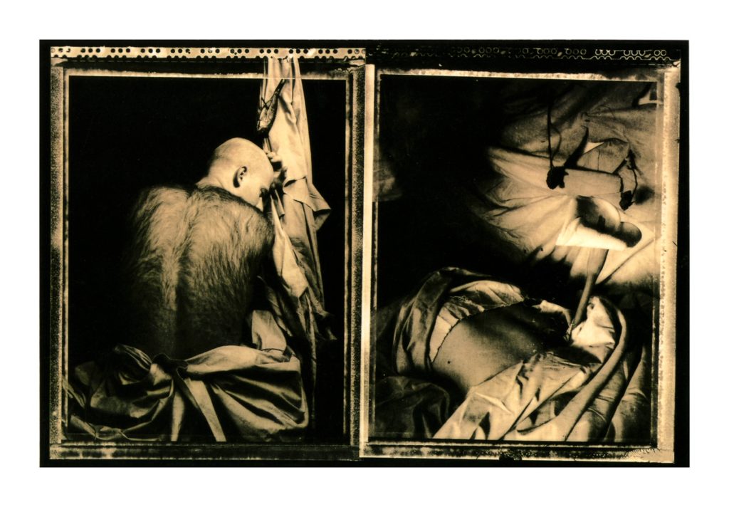
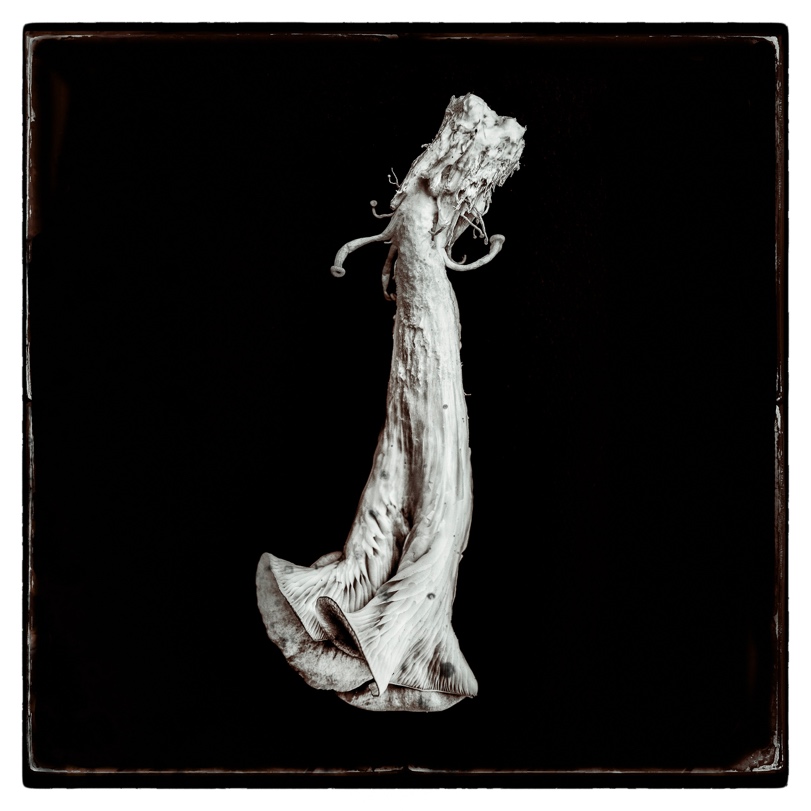
Two years passed and my degree show was on the walls and it was the summer of 1987. Once afternoon I was walking towards my work when I saw this tall figure in black with a skinhead, peering closely at my work. At first, I didn’t recognize him, until he turned to me and spoke in his gentle Geordie accent and asked about two of the photographs. One of them depicted a hirsute man, the other image was of a plant protruding out of a stomach. We got talking and he mentioned that 4AD had just signed a new band; the Pixies and could he send a copy of these two photographs to Black Francis (Charles Thompson) who was the front man for band? I was totally knocked out. That moment was to cement a collaborative relationship and begin a friendship that was to last almost 35 years.
A month later I was in the 4AD offices, in a small design studio that had now become v23 (no longer 23 Envelope) that housed two desks; one belonging to Vaughan and the other Chris Bigg (who was the second half of v23). Chris’ hand-drawn letters and fonts were a key factor in the 4AD creative style that the all the sleeves would later share. I believe looking back that Chris’ own massive contribution was somewhat overshadowed, and I think that it’s always important to recognize that complex design projects are always a collaborative effort and the history of design doesn’t always positively reflect that.
Many urban legends have been posited over the years about how we worked together and what are motives were, questions were asked about the identities of the hirsute man and the flamenco dancer. I don’t think either of us would realize just how significant that very first meeting was and how years 35-years later Vaughan’s design work for the Pixies and other 4AD bands, would revolutionize contemporary design. My photographs have become iconic because Vaughan’s designs so embodied the images that I think the relationship between his designs and my photographs haves become inseparable over time. We trusted each other’s creative vision implicitly and Vaughan was one of the very few (including Chris) who never asked me to reshoot or reprint an image. For example, in the case of the photographs of Doolittle I only shot one roll (twelve frames) per image and we selected from a single contact sheet.
Over the years much has been written about our collaborative efforts which also included the first series of Red House Painters sleeves (Down Colorful Hill, 1992, Bridge, 1993 and Shock Me EP, 1993), a sleeve for Heidi Berry (Heidi Berry, 1993) Michael Brook (Cobalt Blue, 1992) and a host of commercial projects that were not 4AD related. All this information is easily gleaned from a quick trawl on the web. We also both shared a deep fascination with cinema and photography; Vaughan was the only person who I knew who had the Nimrod’s Son (hirsute man from Come on Pilgrim) hung on the same wall as several Joel-Peter Witkin’s. What I want to recall here are four very memorable and important times that I feel best describes our collaborative relationship.
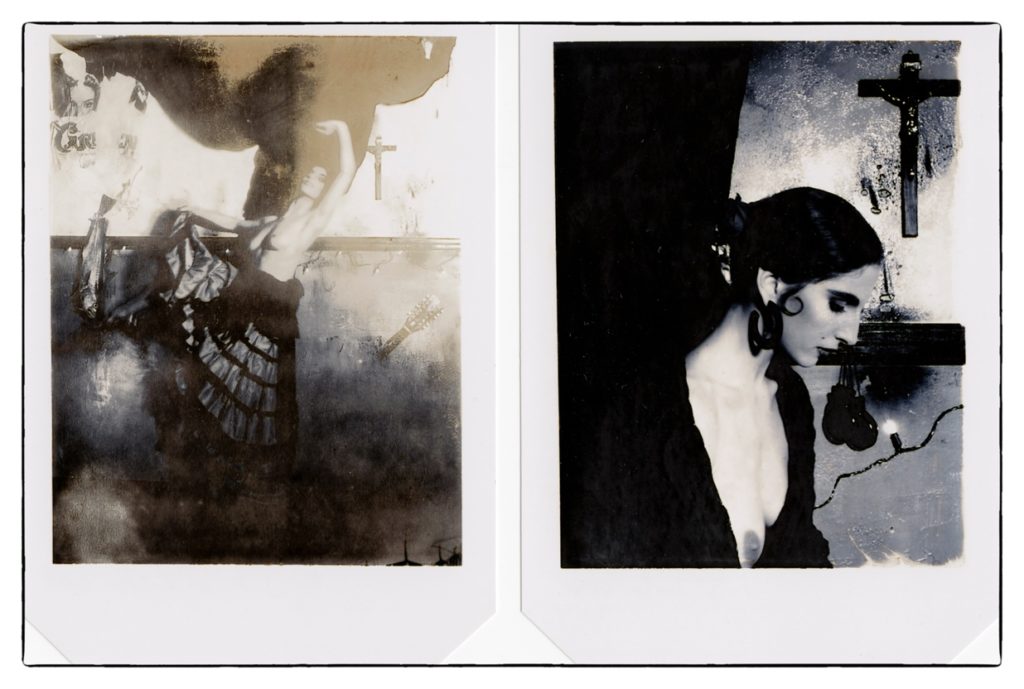
The first instance was the Surfer Rosa shoot which took place on a single day in the upstairs room of the pub opposite the Alma Road 4AD office. The reason we chose this was apart from the fact it was next door it also had a slightly raised stage in a corner of a large open room. Band’s played live during the evenings. I need a space large enough to get some distance from the subject (the flamenco dancer) to include the backdrop. Vaughan, Chris and I, hand-built the background working with two 8’ x 4’ boards of MDF, on which we recreated the peeling decrepit walls of what was supposed to suggest an old bar in Mexico – this idea came from Charles. Chris had bought a huge cod from the fish market and we hung that on the wall in pride of place. I always remember paying a lot of attention to making sure the cod itself was visible when I made the prints in my darkroom.
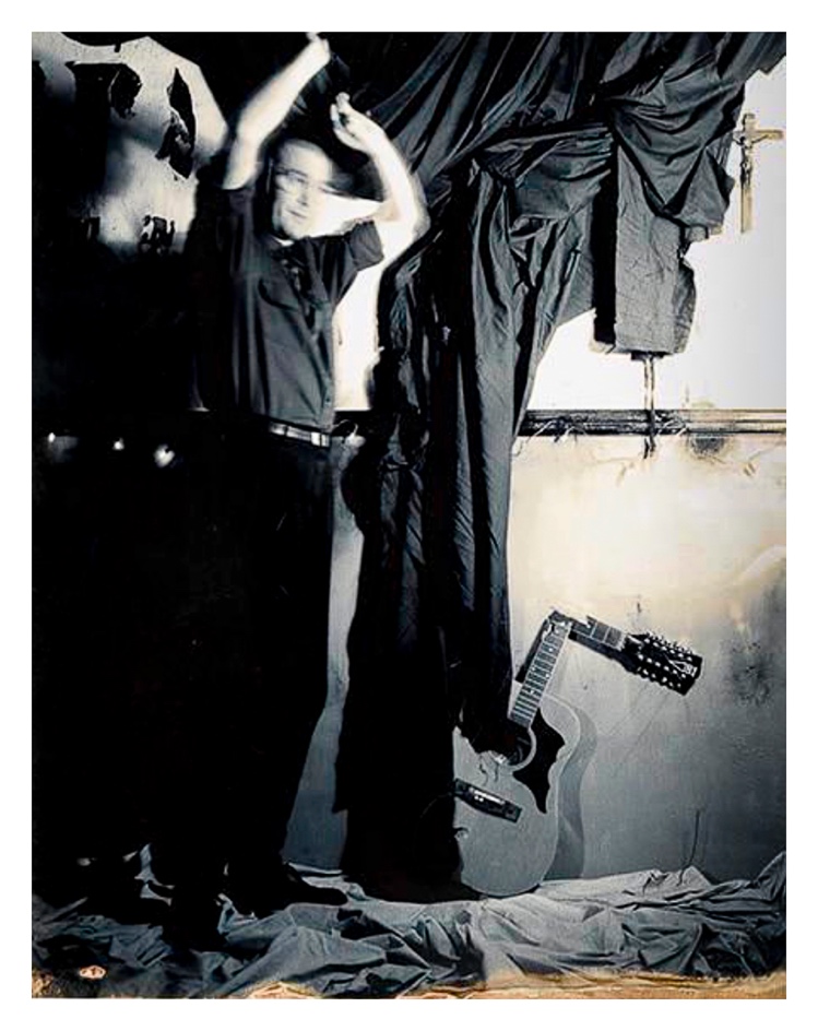
Usually I work alone and without an entourage of assistants but in this case the set was complex and large scale. Vaughan wanted there to be a clear visual link between the Come on Pilgrim sleeve and this second LP (whose exact title was as yet unconfirmed during the shoot) so I decided to work with the same Polaroid Type 55 film which has its distinctive film edges created when you separate the negative from the peel-apart print. We also required the model to be topless (another suggestion from Charles I believe) and I think the three of us were all a bit shy about asking the model. So, between us as the morning moved on, and shooting a single polaroid at a time, we gradually worked around to what is now known as Surfer Rosa #1. Once we felt we had successfully captured the long-view shots we moved closer and I shot only 4 three-quarter length-views, one of which made it onto the back sleeve; Surfer Rosa #3. It was a frenetic day and one that I think we all have fond memories of. In all we only made about 26 Polaroids, but we all felt we had got what we needed. I made one single Polaroid image of Vaughan dancing on the set so that I could configure exactly the right composition before shooting the model herself.
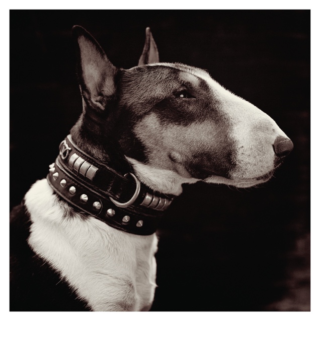
The second experience was how my photograph of an English Bull Terrier named Spike become the cover of the Pixies’ single Here Comes Your Man (1989). I had invited Vaughan to an opening of an exhibition in London’s very fashionable Kensington Park Road. The theme of the exhibition was animals and the only criteria was that it was personal work and not commissioned. On seeing my photograph, Vaughan immediately asked if he could send a copy to Charles because 4AD was releasing another single from the band. As it happened, I had a contact sheet at the gallery, and I gave him this. He slipped it into his bag saying something along the lines of “that will do the trick!” It was as simple as that. Vaughan had seen potential in an image that I had deliberately not shown him so that I could exhibit it in the exhibition and had immediately contacted the Pixies and got their approval!
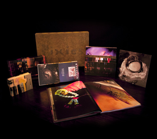
The third time is the Minotaur package which was a project commissioned by Geoff Anderson at A+R / Artists in Residence in the summer of 2008, scheduled to be released in autumn of 2009. By that time, I had long since left London and based myself in South East Asia working between Thailand and Cambodia. So, on receiving news of the project, I made the decision to shoot everything outside of the U.K. and experiment with small digital point and shoot cameras (a pair of diminutive Ricoh GR2’s). This was a deliberate move away the rigid formality of large format half/plate cameras). And this is where Vaughan’s implicit trust in me came into play on a massive project.
I shot everything within a 4-month block of time then visited Vaughan in his home in England in early 2009 with a hard drive of digital files and slowly revealed what I’d been shooting during my time in South East Asia. Vaughan was very excited to see the results and we made an initial edit of small prints laid out on the tables and floors. I then rendered all the files with the gritty feel I wanted them to evoke. It was to be a long hard learning curve in the early days of Adobe’s Lightroom 2 and Phase One’s Capture One 5.
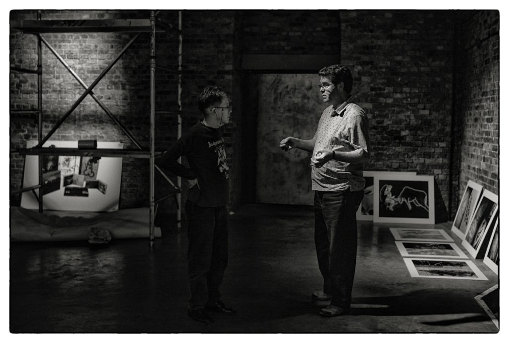
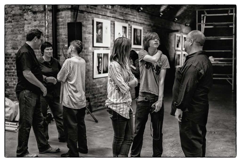
In the summer of 2009, Vaughan and I met up again in Epsom with our friend and mentor Terry who had also collaborated on the Minotaur project. It was one of the most amazing creative experiences I can remember in that all three of us were working together on one project. Both Vaughan and I were a bit nervous as we laid out the work in front of Terry after so many years since he had coached us. Terry was very complimentary. Two days later we met again when the Pixies played to 300 specially invited guests at London’s Village Underground, on June 15th. The three of us spent the afternoon laying out huge posters on the floor and deciding on the layout of the show. This day was made more memorable in that my own children (Jack and Lucy) who had grown up listening to the Pixies music, as young adults got to meet the Pixies, Vaughan and Terry during the privacy of the soundcheck. So, in that day the whole Pixies thing had turned full circle, reuniting everyone.
Flash forward to 2019 and out of the blue on the 10th of April 2019, ten years later I opened my email in-box to see this:
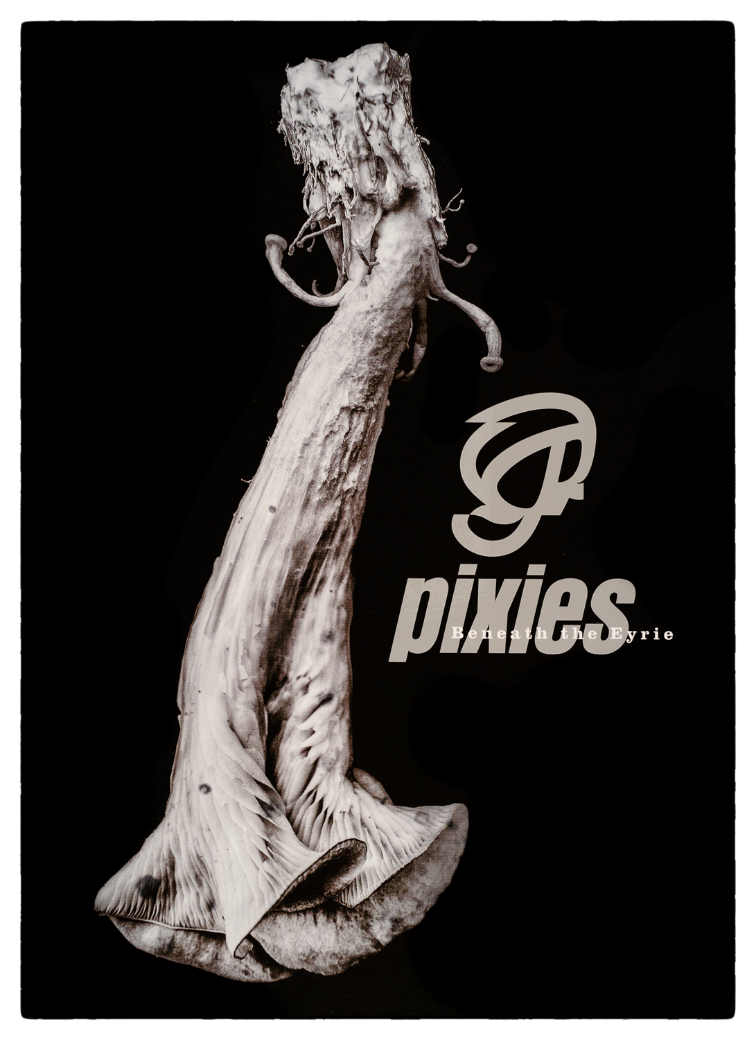
“Hi Simon, I’m currently working on a new album artwork for the Pixies. Would you like me to present some of your Cornucopiae images?
I think they suit a new darker trend in their music. Attached are the lyrics for Catfish Kate which I have identified as lead song. I see her in Pleurotus IV. Would you like to saddle up again?
v”
So, I revisited my archive and re-examined the series of photographs entitled Pleurotus Cornucopiae that contained images of Pleurotus Ostreatus mushrooms that I had grown in the Northeast of Thailand during 2014. It was typical of Vaughan and it made me smile to think that yet again we had turned full circle he was seeing something one of the images; Pleurotus IV that he then identified in one of the new Pixies’ songs; Catfish Kate. And this is the beauty of how Vaughan’s mind works and how we intuitively connect. And that’s how we worked.
On the 23rd of April we got the go-ahead but more importantly it opened the channels to work together again on the Pixies’ sleeves.
“Oh yes Simon, your jpgs are all wonderful. Very inspiring. I’ll let you know how I get on. Thank you so much. You have given me a right good boost this morning.
Here’s to you,
v”
And then tragically on the 29th December at 13.30 pm GMT, when I was sat with Terry (who still lives in Newcastle-Upon-Tyne), I was notified by Vaughan’s wife Lee, that Vaughan had died peacefully in hospital. We had both been aware that his condition had become critical the day before. But the shock was catastrophic.
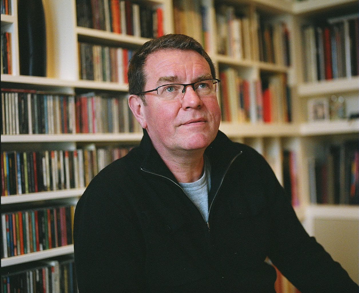
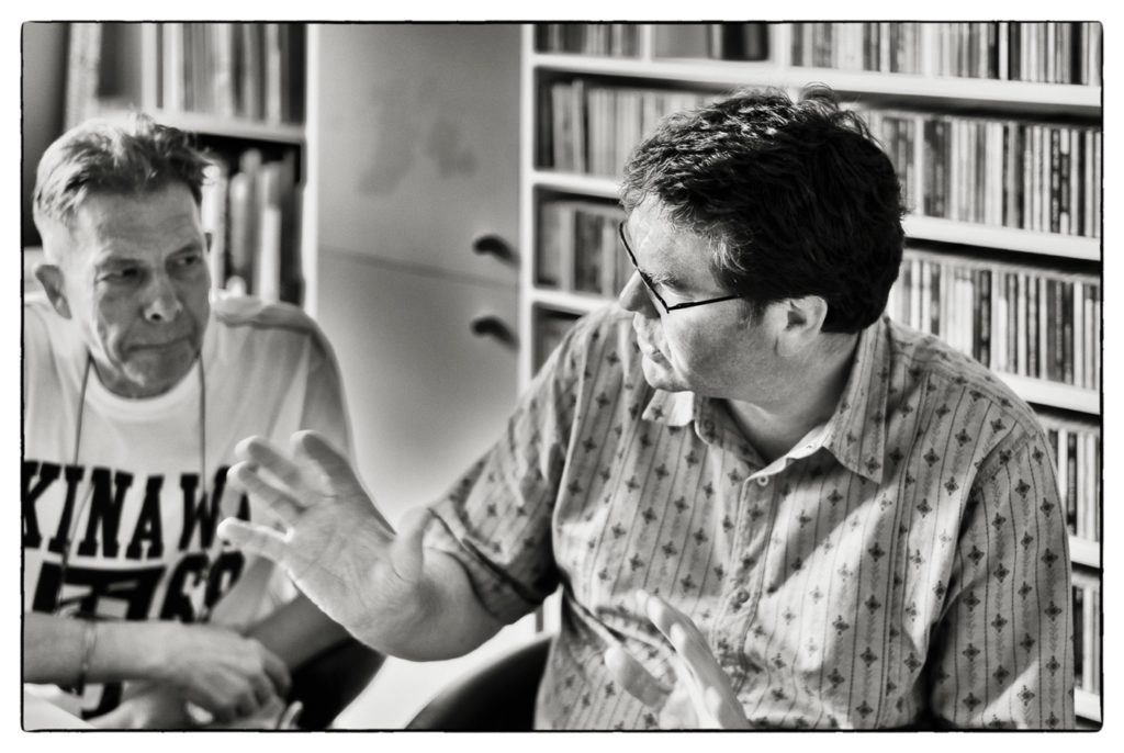
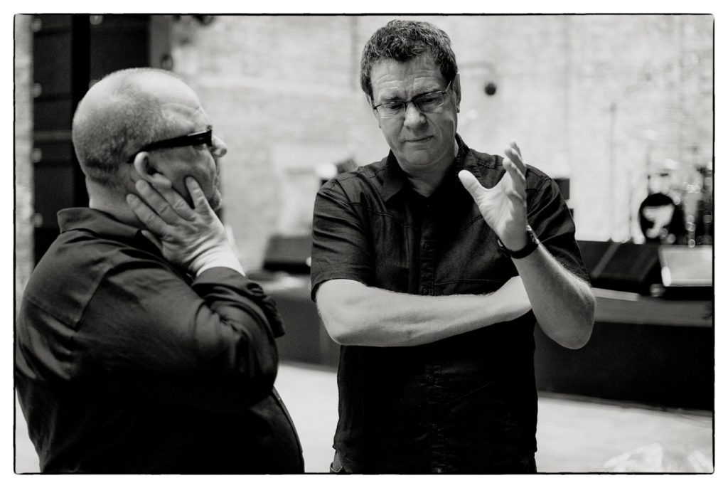
Looking back over the very few photographs I had made of Vaughan over the years it’s immediately noticeable how much Vaughan talked with his hands which echoed his enthusiasm for his work. He was so deeply passionate about his music. His immeasurable influence in the field of design is unmatched in my opinion but then I’m biased as he was my friend.
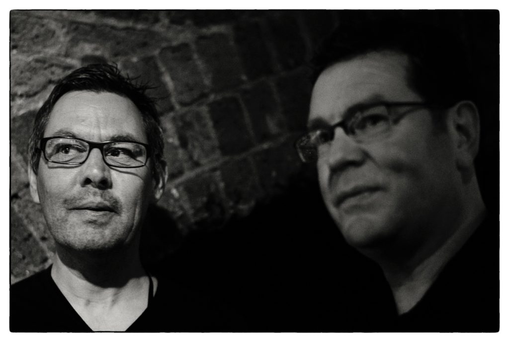
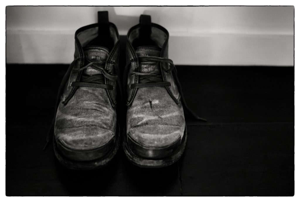
It seems fitting to end this obituary with what I consider to be two key images – the first a very rare photograph of Chris and Vaughan at the Village Underground, 15th June 2009 and secondly an image that I had made at his home in Epsom, two days before; his well-worn suede boots, which contrasted so strongly with my steel-toed Dr Martins that I was wearing at the time.
It’s hard to write anything more meaningful past this point other than that his passing has left a vacuum that is hard to comprehend and impossible to fill. He has left a creative legacy that will live on for many years to come and colossal shoes to fill.
We miss you Vaughan (RIP) and we always will.
Simon Larbalestier, 15th January 2020.
Terry Dowling, teacher
Vaughan Oliver was my student. Vaughan was also my colleague and collaborator, who championed and commissioned me, which I valued and respected. And Vaughan was my friend. I admired and advised him, I was astonished and amazed by his work. For over 30 years, he never failed to surprise and delight me. He was a remarkable and very special, unique designer ; but most of all, he was a kind, generous, loyal friend – I will miss him deeply.
I taught Vaughan graphic design at Newcastle Polytechnic. As a student he was a brilliant rebel ; I loved this. Original,strong minded , gifted – he always surprised and often shocked with his art work. He had an exceptional ‘eye’. He relentlessly questioned and queried my advice and guidance; I enjoyed that. He was my kind of student; challenging yet receptive and creative. At that time in the 80s, I taught and nurtured a cohort of exceptionally talented students, which included Vaughan Oliver, Simon Labalestier and Nigel Grierson amongst others, and with whom he later worked. Vaughn always referred to himself as a graphic designer; he was an outstanding art director, shrewdly selecting and collaborating with artists, illustrators, photographers and designers. But he brought it all together . This reflected his generous nature; he drew the best from his collaborators. It reflected his brilliant critical ‘eye’. It was a challenge, but always a pleasure to work for Vaughn, work with him.
Vaughan often sent me copies of his work; I really looked forward to these parcels popping through the post box. He continued to surprise and delight; he knew how much I valued his art work – and would enjoy the music. He used my illustrations for Clan of Xymox, the Pixies, and most notably the limited edition box set : for which I produced a screen print. This was an original and imaginative concept of celebrating the musicians, and typical of Vaughan. He respected his artists ; he let them ‘have their head’. His art direction was subtle, light touch, which is why it works and will endure.
I am now very ill ; I have advanced Parkinson’s. Vaughan was commissioned to produce posters to raise awareness of this degenerative, cruelly debilitating disease. I was touched when he asked me how I felt and how I suffer. This is sensitively reflected in his highly original and captivating art work for the campaign. The shattered head, the blurred figure, the bent, twisted bodies encapsulate this vile disease. They are not obvious illustrations or a straight depiction of the illness. It makes you think, makes you question, reflect – and think again.
This was the Vaughan I knew and valued so dearly. He made you think, question, think again and reflect. I do that now: think and reflect on Vaughan’s memory and legacy. I will miss him deeply. His wicked but gentle sense of humour , which so reflected his Co. Durham heritage : tough on the outside shielding the soft sensitive inside. A short aside from Vaughan said it all. It was like his work : succinct, to the point but also beautiful, aesthetic and thought provoking. His choice colours, the careful line, the surreal juxtaposition of images – Vaughan brought it all together. He made you think, surprised and delighted. A true creative who will be missed by me – and many.
Ian Masters (Pale Saints)
It’s all a very long time ago, in a country far far away, so my memories are quite vague now. As far as I remember, all of the members of the band enjoyed Vaughan’s work, and he was a really stubborn so and so, who preferred to be left alone with the music and some initial ideas from the band at the most, and certainly not to be interfered with. On The Comforts Of Madness, he’d made a beautiful thing to look at but I never felt a strong personal connection to it.
So when it became time to look for a main image for In Ribbons, I started searching around. I remembered that a friend of mine in London, whose Mum was a medical worker, had given me an handful of very odd slides, which had come from a hospital patient. The patient’s insides … As soon as I saw them I told my friend they’d end up on a record sleeve, which made him laugh.
When the recording of In Ribbons had finished, I sent the slides to Vaughan. It was a few weeks later that the band were down in London, and it was then that we got to see the artwork. It looked stunning. Vaughan had had some large panels of glass etched with the band name and song titles and had got Kevin Westenberg to photograph them with some lovely shadows. The back cover looked as beautiful as the front and it’s not often you can say that. I wonder if Vaughan suggested we reverse them. I wouldn’t be surprised if he had.
But he was most excited about the table on the inner sleeve, that he had constructed with our portraits on, which he’d Frankensteined together somehow from bits and pieces. And also the starfish, reminiscent of the chicken in Eraserhead, with what looked like a stumpy penis on the other side of the inner. With Vaughan you got the whole package, the beauty, the playfulness, the hilarious crude humour and the downright dada. And that was kind of what he was like, really.
