It is very rare that music fans mourn the loss of an artist who has never recorded a single note. Yet this is exactly what happened when we lost the designer Vaughan Oliver at the end of December. His inventive, intriguing and often downright disturbing album covers for Pixies, Cocteau Twins, Lush and so many others, transported listeners to his unique universe. Sometimes more so than the very music of the artists for whom he worked.
Section26 wanted to pay tribute to him by collecting the memories of some of his collaborators, friends and fans. It’s by remembering the album design which marked them most that they recall their extraordinary experiences of working alongside him, his singular character traits or simply the shock of discovering his work for the first time.
 Martin Phillipps (The Chills) « New visions of wonder and intrigue »
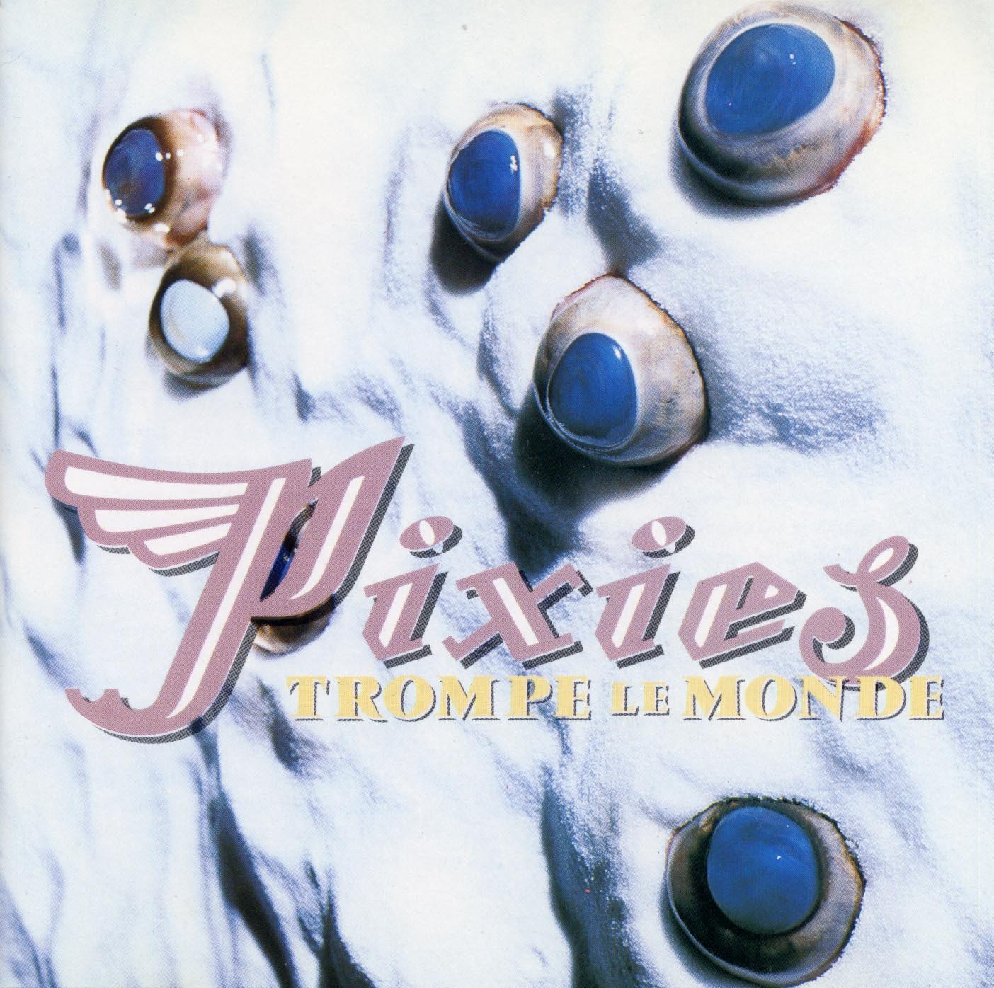
It was the artwork Vaughan Oliver did for the Pixies which first caught my attention and gave me, and others, new visions of wonder and intrigue – but they also personally frustrated me as it suggested that there were many other people who truly understood this arcane imagery in a way which I did not. But then I came to recognise that this response of mine may have been intentionally triggered and that Oliver’s artwork was, perhaps, a deliberate encouragement to any and all viewers to become explorers.
 Phil King (Lush, Felt, The Jesus & Mary Chain) « A very eyecatching and perverse parcel »
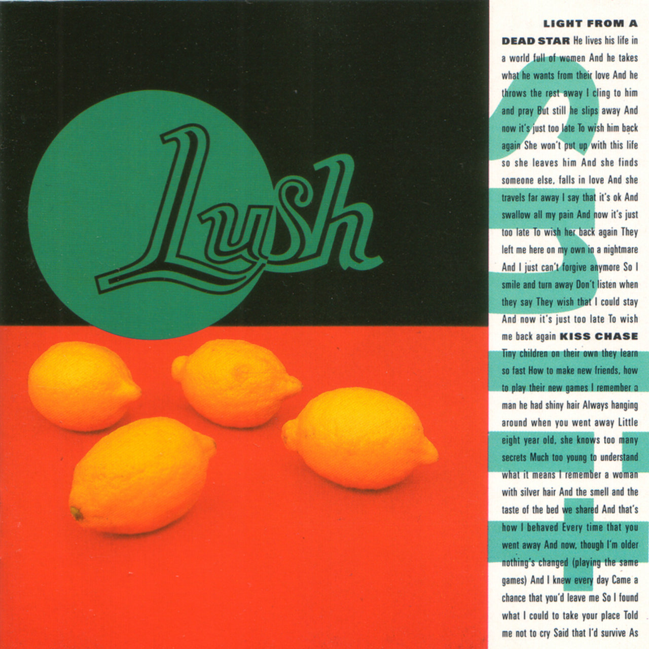
My maybe distorted in hindsight memory of the 4AD office in Alma Road in Wandsworth was that the art department was really the hub of it all there – or at least it seemed that way architectually – as they were situated where the overhead skylights were – and it bathed their space in light. It made sense too as the artwork was such an integral part of the 4AD ethos – and when you signed to 4AD, you knew that it was part and parcel of the label. A very intriguing and eyecatching and perverse parcel it was too. It was also of course always intriguing to go to their workspace and to see what t hey were working on – Vaughan and his assistant Chris Bigg – it was like the sorceror and his apprentice – although saying that any discussion, as with the artwork for the Lush ‘Split‘ album, was done in the pub across the road from the offices, where the cover for Pixies ‘Surfer Rosa‘ was photographed. The period I was in Lush the only ‘campaign’ Vaughan worked on was for the ‘Split’ album cover. Some designers would come up with numerous ideas. I remember Vaughan coming to us with one very strong idea – and it really was the ‘Shock Of The New’ seeing it, the ‘four lemons’ sleeve, but then he left it with you to think about it and it was more a case of you gently and slowly adjusting to the idea – and realising how it was just right. As Vaughan said in an interview ‘the main thing was the ask the band to receive my ideas with an open mind, for them to be receptive to novelty and difference.‘ There always seemed to be an underlying humour to his work too – and he would show it to you with a straight face – and wait for your reaction. And a reaction there would always be – as his work was never commonplace or boring. It was as if he was allowing you entry not so much into his world – but his constellation of awe inspiring visual ideas stretching off into infinity.
 Pascal Blua (graphic designer) « An inexhaustible source of inspiration »
It is early 1990. A group of friends work in a design studio that we founded together, united by a common passion for independent music and graphic design. We have proudly named our studio ‘Public Image Factory’, as a tribute to what we dream of being. It was music and more specifically album covers that, for me at least, brought me to where I am ; a passion which, day after day, became my profession. I am entirely self-taught : my training is what I see.
At that time when the internet was at its very beginning, I read the British press like the bible. I obsess over the smallest detail on every album cover and above all, my eyes are on London and what is happening there. My heroes are Jamie Reid, Neville Brody, Peter Saville and Vaughan Oliver.
I’m not sure how we came to own this catalogue from an exhibition devoted to a retrospective (1988-94) of the works of v23, Vaughan Oliver’s studio.
One thing I have not forgotten is my reaction on first leafing through this book. Firstly, its large format, which seems to take up your field of vision. The paper is thick and heavy, the printing enhanced by the use of metallic ink in a 5th colour.
It is an iconographic and typographic explosion : the pages alternate between reproductions of covers, posters, mysterious visual imagery and elegant typography. The work as a whole is punctuated with texts that speak of the artists, the covers, the collaborators … I am fascinated by the attention to detail to the smallest design detail, the use of white, the space and the balance of the layout.
This catalogue left an indelible mark on me and I have returned to it repeatedly over the years. I come back to the book again and again to recapture this sense of wonderment, but it is also as an inexhaustible source of inspiration, a loyal friend whom we keep close to us and take refuge in.
In 2017, I discovered that Unit Editions had launched an anthology which brought together Vaughan Oliver’s archives. It is a project that I could not resist, an irresistible open access to his research, the final stages of each project, and every abandoned, forgotten, or rejected project. In short, a project which has fascinated me for 30 years.
The strength of Vaughan Oliver’s signature is immediately recognizable in these designs and yet is also elusive. His visuals and the music of the artists of the 4AD label are as one, as if they were inseparable. On that nightmarish Sunday when Vaughan closed his eyes forever, I made a secret promise to always keep mine open, and as capable of wonder as on that first day.
 Stuart Moxham (Young Marble Giants, The Gist)
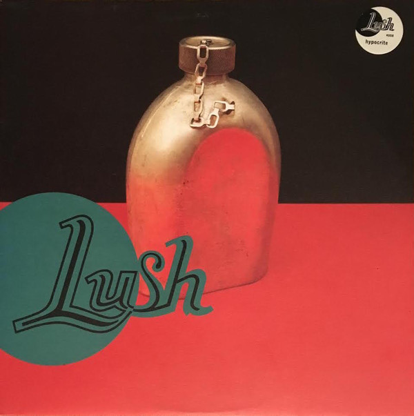
It has to be « Hypocrite » by Lush. The mystifying image of a water bottle on the crisp clean design…and I would be a hypocrite if I didn’t confess that they covered a song of mine on the CD too ! (ed : Love At First Sight)
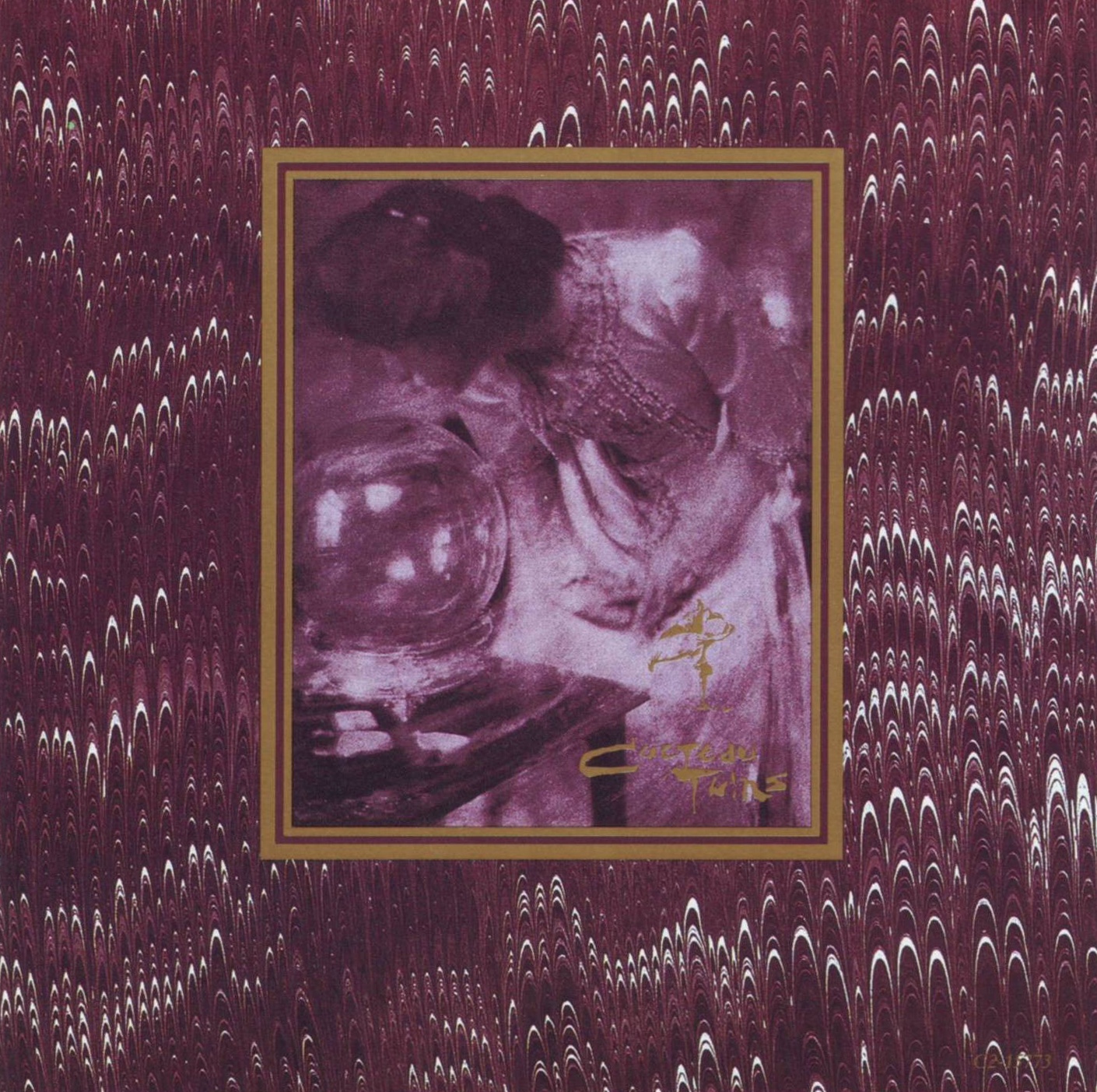
 Simon Raymonde (Cocteau Twins, Bella Union owner) « Everything started with the music »
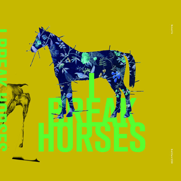
The sleeves Vaughan did for our Swedish artist I Break Horses in 2011 were so special and really like nothing he had created before. There are many album designers with their own strong visual style that is mirrored through their work which they impose on the artist, and to be fair this often works, but while Vaughan was forthright and had conviction in his ideas, he never let his own “brand” take the lead when designing an album sleeve. Everything started with the music for him and he always tried to get an understanding of the artist themselves and what made them tick. With I Break Horses, after a lot of time sitting with the music, he sent over some ideas in email and “horses” were the main theme of his design. Initially I wasn’t sure simply because it seemed a bit obvious. He took that on board and came back with other ideas, but asked that we reconsider the “horses” theme and at least allow him to put some artwork together. When we saw it, it blew me away. It just fitted the music and the band perfectly. The colour palette he used was unlike anything others would have used and because we had a 12” EP for him to design as well at the same time, I knew from Cocteau Twins designs he had done for us in the 80s, he would be able to tie them together in a unique way. They are so beautiful TOGETHER that when anyone comes in our vinyl shop to buy the album, I insist that they purchase the 12” Ep too because they have to be seen and experienced together. When you pick up a Vaughan Oliver sleeve there will ALWAYS be enough intrigue and mystery there to keep you entertained throughout the full listening process! The layers of typography, the mixture of unique handwriting and font, the subtle colour shifts and that beautiful way that he would have text wrapping across one board to another. He really was a master of his craft, & yet there was often a sense of humour at play, maybe it was subliminal and often just barely visible, below the surface. His sleeves often gave the artists that air of mystery that is so absent from much album artwork these days. I see so many sleeves with bland band photos on, that 20 years ago would have just been the main promotional photo that they used when sending the PR documents out to press, not the actual album sleeve.
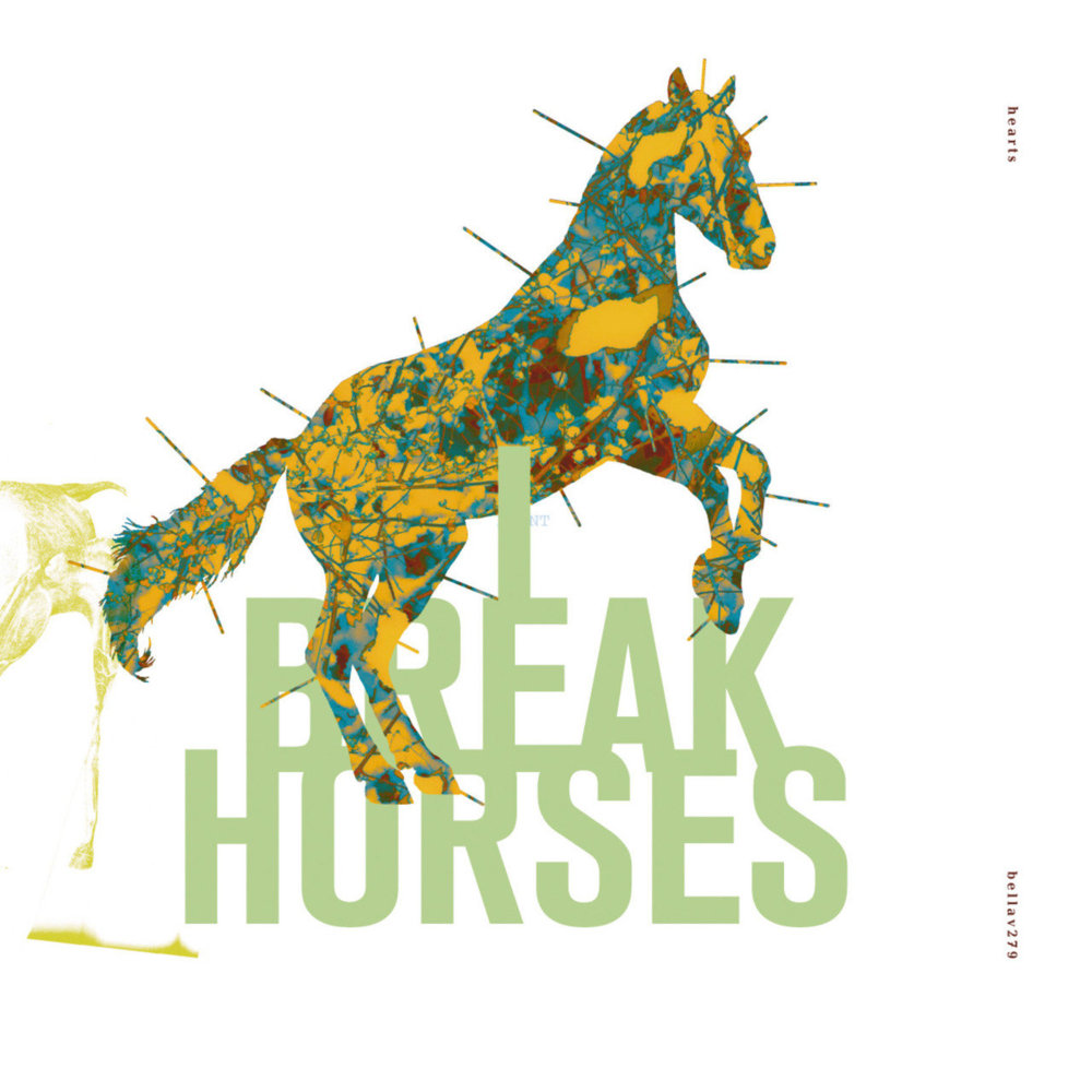 The I Break Horses sleeves for Winter Beats ep and the self-titled debut album had these beautiful anatomical drawings of horses with little pins around the silhouette of the horse that looked like its acupuncture points. The colours he used I had never seen on a sleeve before, and this remains one of my favourite Vaughan Oliver designs. <He also created the sleeve art for the Snowbird album ‘(Moon)’ I released in 2012 and that is equally gorgeous but I have written about that elsewhere recently.>
 JD Beauvallet (Journalist, Les Inrockuptibles, from 1986 to 2019) « An immense song rendered both grandiose and distorted by its cover »
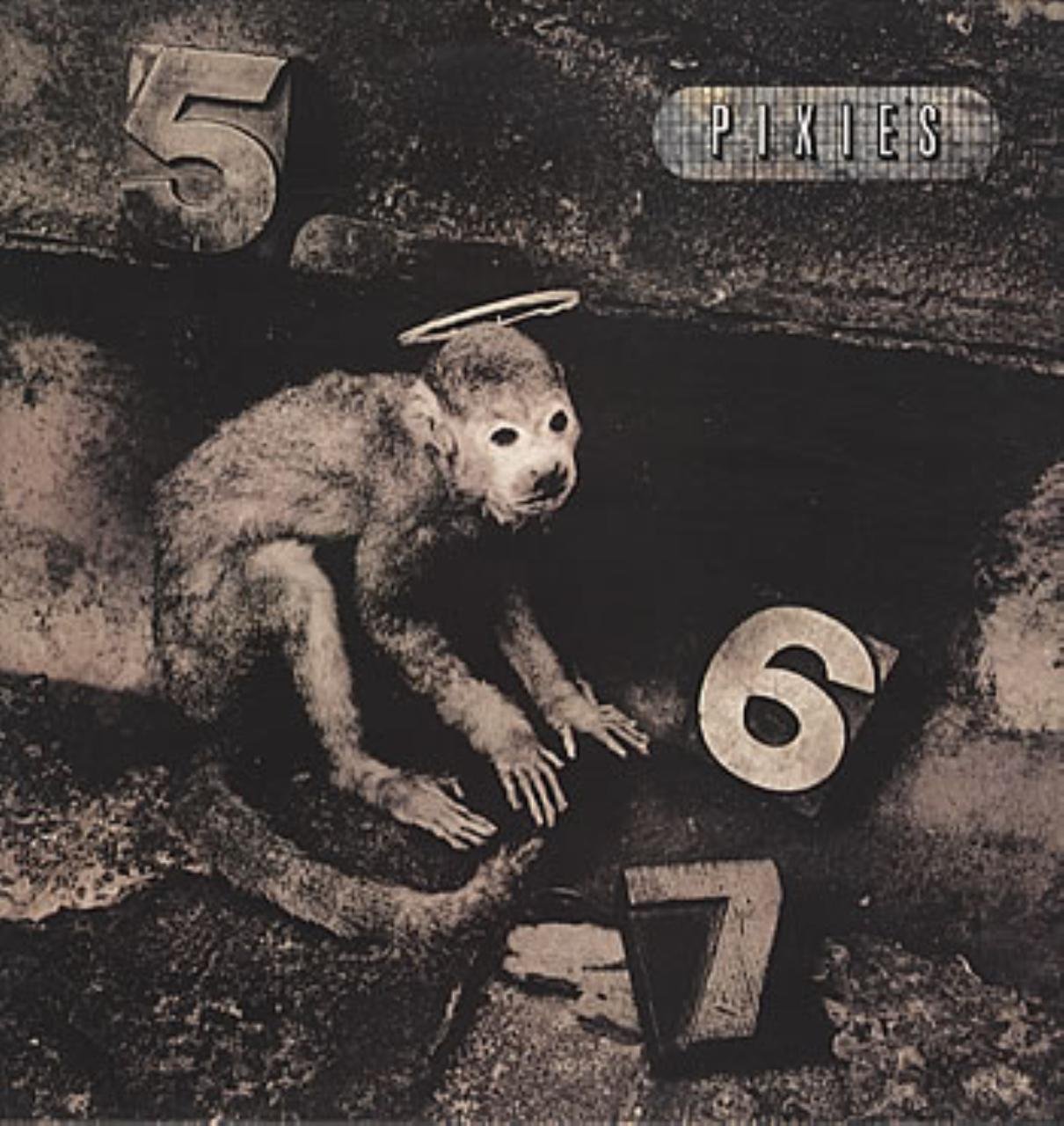
Sometimes in the history of rock, an album cover clashes so much with what has become standard, the established norms of cover design, that they make the music inside the sleeve even more fascinating and mysterious, even before we listen to it. Would the music of Joy Division have led to current levels of obsession and fascination without the armour invented by Peter Saville for it ? We should ask ourselves this question whilst looking at the cabinet of curiosities, at once both slightly macabre and yet also playful, brought together by Vaughan Oliver for the wonderful release of Monkey Gone To Heaven. An immense song rendered both grandiose and distorted by its cover. The old aesthetic of rock, to the despair of its short-sighted bigots, would look pitiful when confronted with this precious, absurd and meteoric aesthetic. We could no longer do old school artwork after such a breath of fresh air.
 Mick Conroy (Modern English) « A friendship and an amazing working relationship that span over four decades »
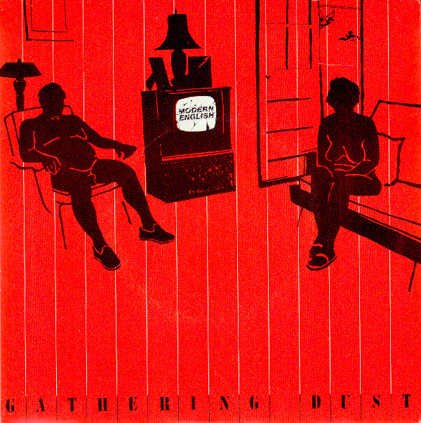
In 1980, my band Modern English signed to the newly launched record label called “4AD”. Early that year we were to release our first single ‘Swans On Glass’. When it came to the release of the second 7” single a few months later, the label owner Ivo Watts-Russell called in a young graphic designer to show us his portfolio of work. This was our first meeting with Vaughan Oliver, Modern English had previously been making our own flyers and posters to advertise our various gigs in and around our local town of Colchester, before making our way to London, just shortly after we had signed to 4AD. One of our recurring images we used was a Diane Arbus photo. ‘Retired man and his wife in a nudist camp one morning, NJ 1963’.
Vaughan opened his portfolio, which contained work from his art school days and, as I recall some advertising work he had recently done. It was bold graphics and images of light bulbs. Amongst his scattered work that he displayed on the floor was the reoccurring image with his spin of the Diane Arbus nudist couple, but in stark black and red. Plus very oddly, Vaughan had placed a gigantic Sea Lion in the middle of the couples living room lying on the carpet. The coincidence was undeniable, we immediately made our decision to use him for what would turn out to be his first record sleeve : Modern English, ‘Gathering Dust’
. From that moment a friendship and an amazing working relationship was born that would span over the next four decades.
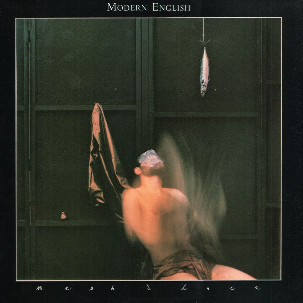 Vaughan then went to work on the sleeve for our and his very first LP ‘Mesh & Lace’. He had by now been collaborating with his best friend Nigel Grierson, who like him had come down to London from the north east of England. Nigel was the photographer, and Vaughan, the graphic artist. With ‘Mesh & Lace’ it had become very clear that Vaughan loved music and was interested in what the music was saying to the listener. He asked to have us record rehearsals and demos of what we were doing. We were shown sketches and photos of ideas the he and Nigel had been gathering. Vaughan had pretty firm views of what he wanted, and also of what he thought we needed. I remember being at such a young age as I was so impressed. One day when Vaughan informed me that he had been ‘visually trained’, he was just taking the Micky out of me obviously, but with a grand smile. Vaughan was always a very funny person.
Within a couple of years 4AD records had a growing roster of new bands, The The, Cocteau Twins, Colourbox and The Wolfgang Press. Vaughan had by now become Ivo and 4AD’s first full time employee, coinciding with the move to new headquarters in Wandsworth just south of the river Thames. More new bands were signed, Lush and notably Pixies, probably Vaughan’s most famous work was made for this Boston band.
Years passed and both Modern English and Vaughan had long left 4AD, but we remained friends, and whenever I made a Modern English record I would ask him to do the artwork. On one such occasion he said ‘Who the fuck else would do it ?’
Vaughan was always expressive and full of surprises. When I told him one LP was to be called ‘Pillow Lips’, he paused, then stuck his tongue in my ear and said, ‘the art will look something like how that just felt’.
At the end of this year, Modern English acquired the rights to our entire back catalogue for the USA. Except for reasons not known to us, we were told that we could not reproduce any of the original artwork or any of the old band logos that Vaughan had created, on our upcoming re-releases. This of course provided a perfect opportunity for us to work and collaborate with Vaughan again, and for him to re-visit our first three 4AD albums, ‘Mesh & Lace’, ‘After The Snow’ and ‘Ricochet Days’. Just weeks ago (December 6th, 2019), we re-released our first two albums, the artwork was of course beautifully created by Vaughan – made with nods and very subtle references to the original pieces from over 35 years ago. We had asked Vaughan that the third LP of our 4AD trilogy ‘Ricochet Days’ be ready for release in mid 2020.
I received a lovely email from Ivo on the 29th December, hours after I was informed of Vaughan’s death. Ivo had noted that Vaughan had started his career with Modern English, and with that, coming full circle, his last work was for Modern English.
Sadly we have lost a friend, an innovator, a genius who made us look, think and always laugh.
 James Leesley (Studio Electrophonique) « Listen to the music and look at the sleeve of the record simultaneously »
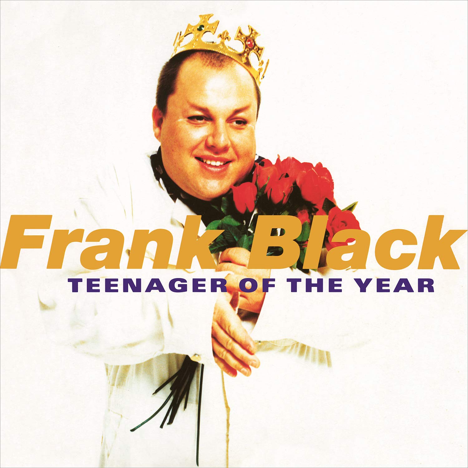
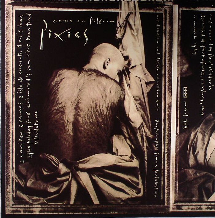 Frank Black (Pixies) « The look and smell and feel of things »
Vaughan was the artist who was the beginning marker for our own artistic journey. We saw the first mock-up of the first Come On Pilgrim sleeve, quit our jobs, and never looked back, and he always represented us visually from that day forward. He was modern and worldly and also clearly a primalist.
He loved the look and smell and feel of things, and more than most are able to articulate, which he did most eloquently from deep within his soul’s atelier.
 Jay-Jay Johanson « Just looking at the beautiful artworks »
It was because of Vaughan Oliver that I for the first time started buying records because of the record sleeves – just looking at the beautiful artworks, I knew this music will be amazing – and it always was. His weirdly dark, bizarre and pretty images combined with a sensitive and brutal typography treatment just had an amazing impact on me as a young teenager. My favourites are : Cocteau Twins, Pearly – Dewdrops’ Drops (1984) (The Spangle Maker), Cocteau Twins, Aikea Guinea (1984) (looks similar to the Peter Saville artwork for Joy Division ‘Love Will Tear Us Apart‘) and David Sylvian, Let the Happiness In (September 1987) (ed : not on 4AD – from the album Secrets of the Beehive)
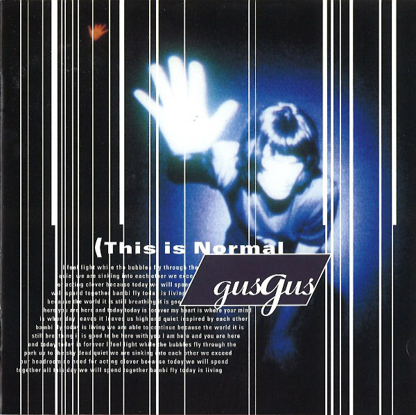
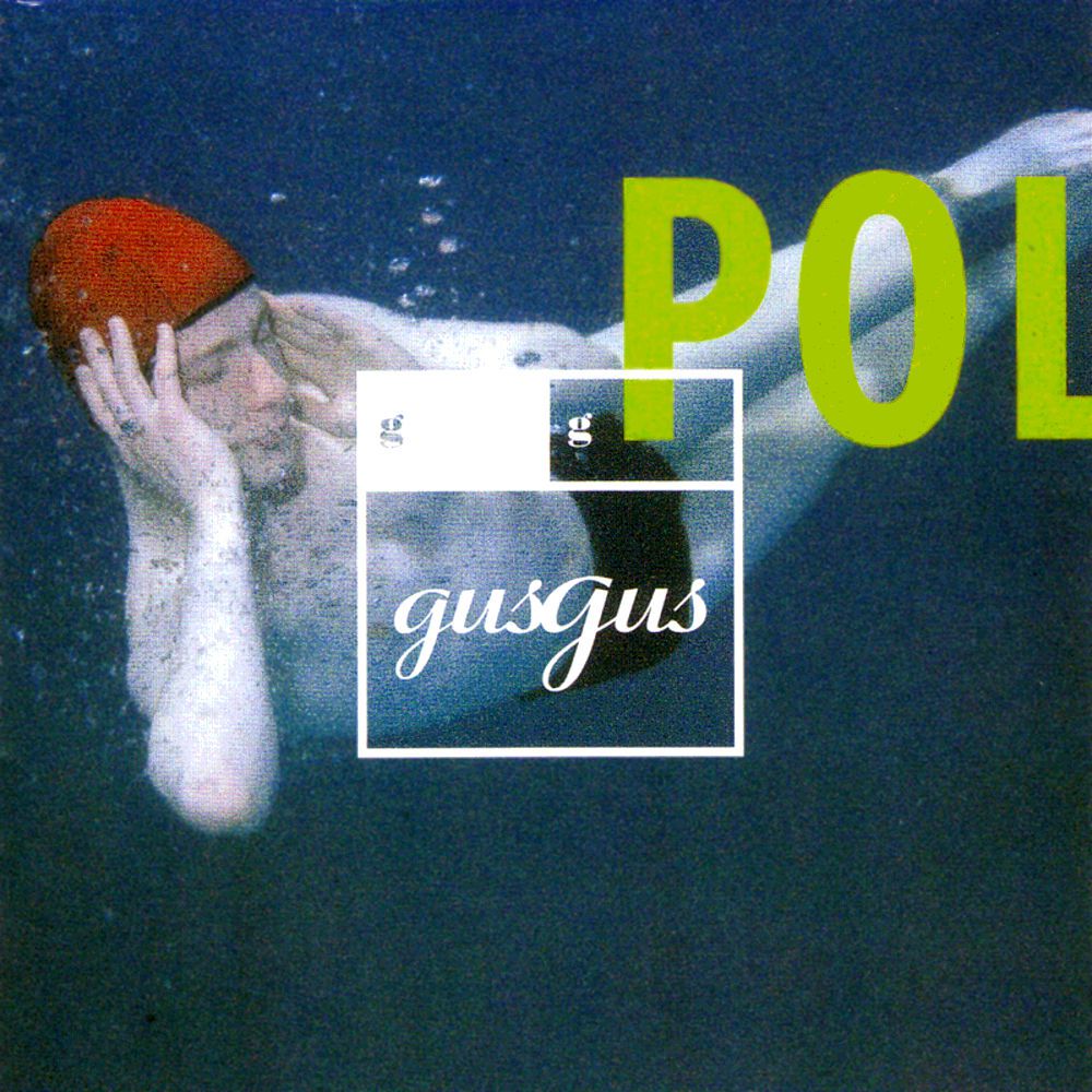 Siggi Kinski (GusGus) « Collaboration was a multi dimensional experience »
It was a great honor and privilege to get the opportunity to work with Vaughan Oliver. What a unique talent and unforgettable character.
GusGus signed with 4AD because the label had rare integrity and depth but it wasn´t until I met Vaughan Oliver that I realized how important his role was in the overall artistic vision of the label. It all made sense when we arrived at the office on Alma Road. Vaughan’s studio was the heart of that place and it seemed like the soul of the company emanated from his work space. He was gentle, outrageous, humble, wild, sweet and completely unpredictable all at once, all the time. I can only imagine how challenging it must have been to deal with nine self-important egotistical Icelanders. He handled it gracefully with his angels Chris Bigg and Paul McMenamin on each side.
It was amazing to hear Vaughan speak about how music inspired him. I could feel his genuine love and respect for music, and as insanely funny he could be, there was an underlying intensity of depth and authentic love for his craft that seemed to drive him. It was a multi dimensional experience to collaborate with him.
When he visited us in Iceland before the release of Polydistortion, Vaughan introduced himself as “Siggi’s stamp-licker”. The message was clear : stop interfering and let me do my work. Unfortunately we did interfere too much in my opinion and I wish GusGus had trusted Vaughan on some ideas that to the majority of the band seemed totally banal at first glance. I believe he could see things we could not see and we missed the boat on a couple of brave statements that could have been made.
 I loved everything Vaughan did for us and every time we received his artwork was a thrilling experience ; an exciting journey into the unknown. One time he presented a uniquely beautiful abstract image to us. As I was admiring it he said in a serious tone : ‘What I like about this image is that it reminds me of semen on a thigh, clad in jeans.’
At another time he was describing a photoshoot that he had just done where he had pushed one of his testicles through a small hole on a large cardboard. The idea was to get an abstract artistic close-up photograph of a single isolated testicle. However, his testicle quickly started to swell and he realized that he would not get it back out of the hole without someone pushing it back from the other side of the cardboard. As he pleaded for help, no one was willing to do the push. Hearing Vaughan tell this story is probably the funniest thing I have every heard.
I remember how striking it was to see the artwork for the Believe singles for the first time, our first release with 4AD. Vaughan elevated GusGus through his graphic design and helped us see more clearly who we were as a band at the time. My feeling is that our self-respect increased through the respect he showed us by offering his energy, heart and talent. Thank you Vaughan, our memories of you are precious. May you rest in peace.
 Chris Bigg (graphist and friend) « Let the accident lead us »
I highlight this project for a number of reasons…
v23 had left the studio we had in Battersea and downsized due to one thing another, so we had gone from four designers down to two, Vaughan and myself working out of his home studio office in Wandsworth, London. In a strange way it was back to 1989 when I had been working with Vaughan at the 4AD offices I had been there since 1986 and it was just the two of us.
Kim Deal from The Breeders had sent us a folder of photographs that a member of the Band had taken in and around the there home of Los Angeles with the instructions to mess them up, but don’t use a computer ! The album ‘Title TK‘ had been recorded all analogue. We then set about cutting, photocopying overprinting and generally taking a very analogue journey, Vaughan suggested we try and break the scanner and see what would happen. This was very much a Vaughan way of making work lets not do what the technology expects, lets make something from nothing, let the accident lead us. After a few days of this chaotic exploration.
Kim was in town so she came down to the studio and very soon it became a three way collaboration, I think its the only time an artist got involved with making work for their project, Kim suggested we used silver foil to really fuck up this poor helpless scanner that was already on its last legs.
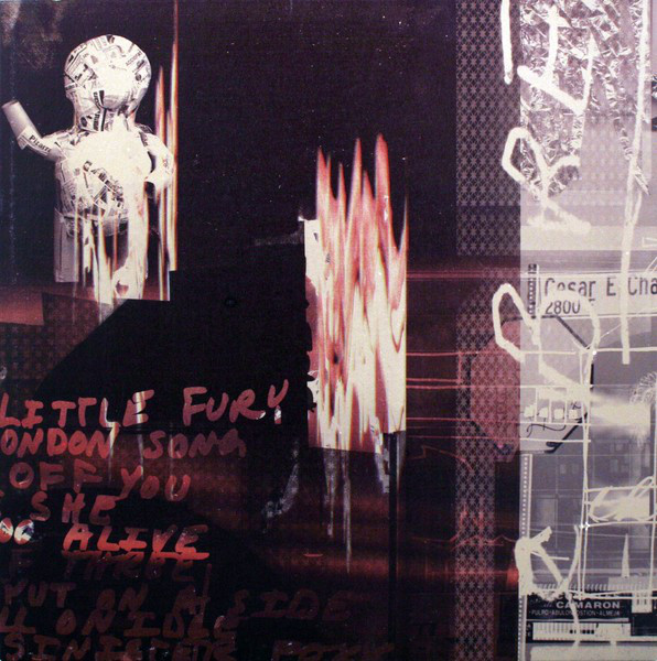
The results were surprising, dark, urgent and exciting. The next day we set about laying the artwork out into the various formats, the whole process took a week and to this day is one of my favourite collaborations and projects, especially the 10” single Off You, which Kim suggested we print on a mirror, Vaughan said we can’t do that but we can print on Mirror Board. It’s stunning, and so is that track. The first song I played the day I heard the Big Man had died.
 Miki Berenyi (Lush, Piroshka) « Riveting, inspiring and extremely funny, serious but never pompous »
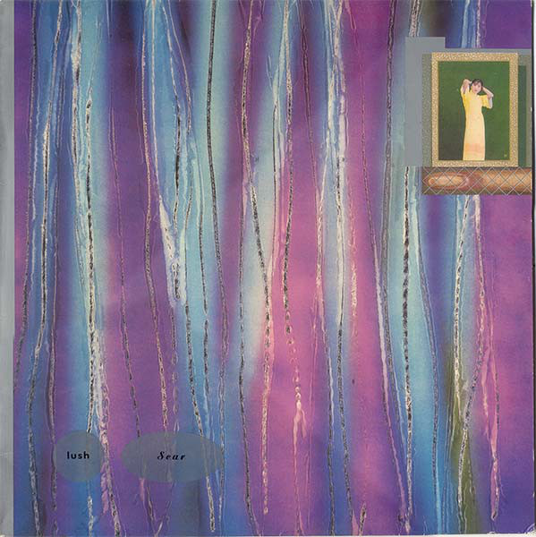
Our first 4AD recording. I loved everything Vaughan did, but I guess this was our first experience and I was thrilled to have him creating a sleeve for our music. We actually named the mini LP Scar after seeing the artwork, inspired by the scratched lines running down the cover. I loved that Vaughan was frank about the sexuality of our music but incorporated it in subtle ways rather than just making it blatant. When I first saw the original vinyl sleeve, with its pink interior and images from two Japanese – or Chinese? – language cards (I think for teaching English) facing each other – ‘tongue’ and ‘elder sister’ – I raised eyebrow at the hints to a vagina and cunnilingus – and he looked at me with this wide-eyed innocent expression like that was completely unintended and it was ME that had the dirty mind ! He totally nailed what Lush were about – there was an innocence about us, and a mix of sweet vocals and scratchiness, especially in the lyrics, plus a mucky foul-mouthed edge ! That’s all there in the subtle colours, the scratched lines, the images of young girls and the playful smuttiness.
The last time I saw him was a few years ago. His work was being exhibited at a university in Epsom and I sat in on a lecture he gave to his students about his work. It was riveting, inspiring and extremely funny, serious but never pompous. Much like the man himself.
